Communication
Related prototypes: Customer Journey Study / Mobile Checkout / Small Merchant Checkout
Language and Tone
Succinctly describing how the system works is a challenge. Content strategy and copywriting is a critical piece of a successful Continuous Authentication implementation, especially when users will have a short attention span or learn about this service while doing something else. Language and tone specifically are key in keeping a delicate balance between conveying the convenience and security of the system, while not seeming overly invasive.
01.Communicate value instead of technical details
Communicate how Continuous Authentication helps rather than how it works.
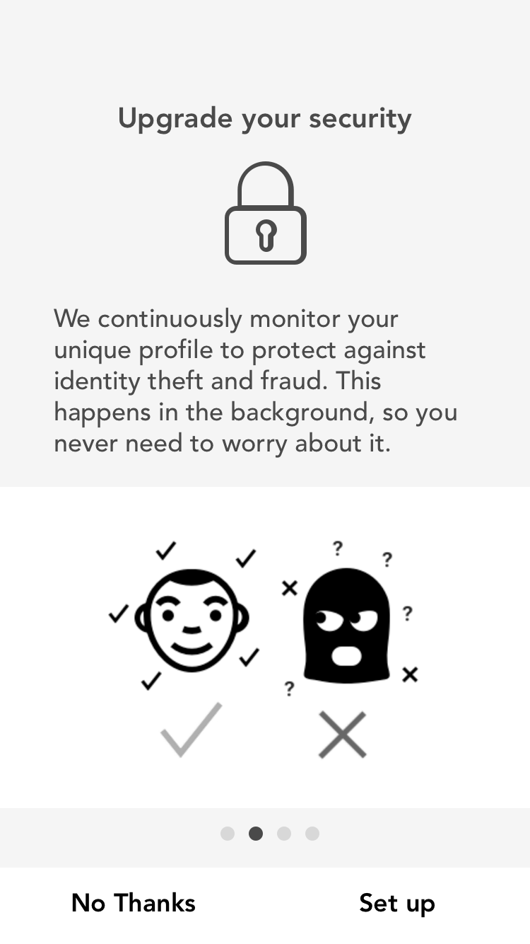 Explain the value of Continuous Authentication.
 Don't use words that imply tracking or dwell on browsing behavior
"I'd be happy that you're being protective but tracking my behavior? To heck with you!"Customer Journey Study
02.Use Mastercard's trusted brand
Communicate that data is stored and protected by Mastercard.
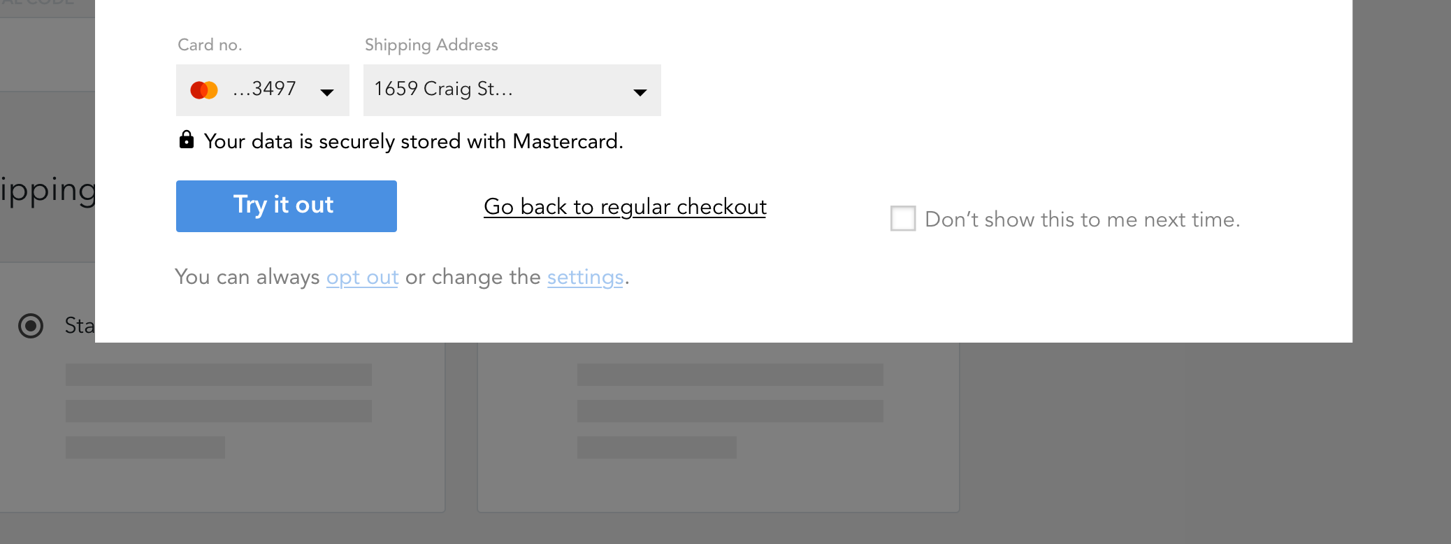 Communicate that data is stored and protected by Mastercard.
"I felt OK about the autofill… the Mastercard symbol here [shows that] it was condoned by Mastercard and it was secure in some way." Customer Journey Study
Using UI Elements
01.Rules of thumb, or heuristics, are powerful ways to make users feel more secure
Using pre-existing UI elements and content design is comforting to users, and enhances the experience as it reinforces their current mental model.
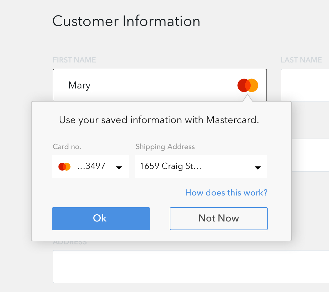
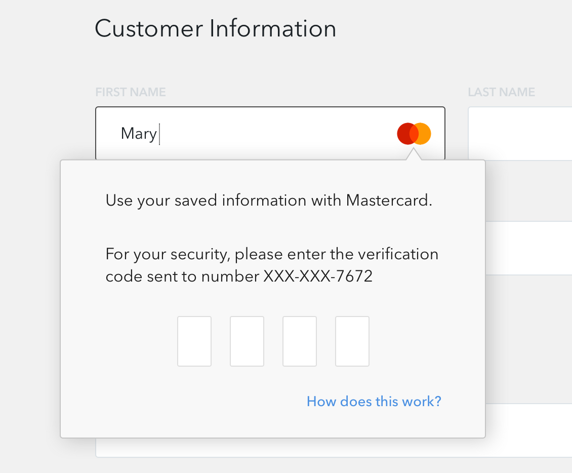
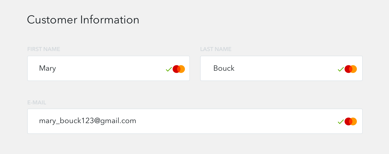 Use mastercard logo and check mark on checkout page.
"The green check make me feel happy. It told me I'm verified. It reassures me that everything is working great." Mobile Checkout
People preferred the Weak - Medium - Strong scale when choosing what sensor data to share with the app. It reinforces their mental model during password creation.
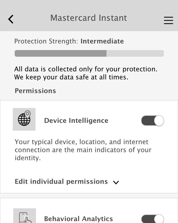 Use a bar to indicate data strength during onboarding.
Creepiness
Talking with Mastercard Researcher Susannah, we came up with a definition for creepiness. Creepiness is a feeling of unease, unsureness, or feeling like you're being tracked. Often it's rooted in a lack of comprehension and a lack of clarity of what's going on.
One of the chief risks of implementing a Continuous Authentication system is triggering a feeling of creepiness in the cardholder. While "creepiness" is hard to define across users, a key related metric is confusion and general comprehension of how the system works. Usually confusion directly correlates to feelings of creepiness, and solid understanding of how the system functions and a feeling of control and autonomy can help alleviate creepiness. Transparency works well to combat these feelings.
Trust
01.Wield Mastercard's brand trust carefully
People don't trust small merchants with their information, but do trust their bank and credit card company.
Mastercard is a very trustworthy brand, and using it can help add immediate trust to the user experience, especially during the first exposure.
"I trust my bank, or Mastercard, but not third parties for keeping my payment details secure."Small Merchant Checkout
02.Tell, and tell again
Provide messaging repetitively throughout the customer journey.
Users were focused on the task at hand (completing the checkout flow) and did not retain much if any of the messaging provided. Some chief reasons for this are: they’re busy, they don’t care about a new service, even a free and positive one, or pop-up blindness.
Showing the value (mostly in the form of autofilling) is better than merely saying this experience is going to be better. However, accompanying messaging needs to be shown repeatedly, maybe a handful of times before a user may fully understand what it is. This may also be an opportunity to re-educate the user on why this is more secure and/or why they are receiving a step-up, for example.
"I don't remember seeing this message!" Customer Journey Study
 After onboarding, give users option to learn more during checkout.
 After onboarding, give users option to learn more during step ups.