Customer Journey Study
Concept
We had 20 study participants over 4 different tracks. Each one visited a new website daily to use a variety of checkout flows. The 8-10 day study wrapped up last week and we had post-interviews over the two weeks. This week we have been analyzing the results, from qualitative to quantitative, and distilling the insights that will go into the UX Guidelines we plan to deliver to the client.
Study Narrative
All four tracks (A, B, C and D) experienced the first three days using our website checkouts as the "normal" web checkout requiring the customer to enter all their info - name, shipping, billing, and credit card info on a web form, and submitting. We alternated the types of websites, and pre-selected generic objects for participants to checkout - a pillow, a basket, a mug, sandwiches, a camera.
Research Questions
- What is the customer journey...
- ...for multiple step-ups?
- ...for the first purchase, and Nth purchase?
- ...between onboarding and the first purchase?
- ...as people stop using passwords gradually?
- ...from a web session point-of-view?
- Do we need to explain what CA is?
- How do users react to a profile being created of them without their consent?
Methodology
10 days
20 participants
45 min pre-study interview
1 hour post-study interview
 A screenshot of the study plan.
Daily Survey
After the participants completed the checkout process, they would fill out a quick survey of their experience: Daily Survey [Google Forms]
Analysis process
With 20 participants, pre and post interviews, as well as the daily survey response feedback, we had tons and tons of data to sift through. The post interviews are where most of the meat came from, and we embarked on another large affinity diagram process, across tracks and days.
We also have aggregated graphs of each track and their comfort levels per day. There are definitely some interesting insights here that we're still analyzing.
 Consolidate results of emotion mapping.
Overall, this was a great last sprint to end on and an educational experience from a research side. We learned tons about asking the right questions at the right time, setting up the right number
Prototypes
The first three days were simplified checkouts where the user was expected to type in their provided credit card details by hand. This was designed to get users into the vein of the test without trying to test variables right away.
Day 1, Bed Bath & Beyond:
Simple checkout on Bed Bath & Beyond → Live Prototype Here
Day 2, Whole Foods:
Simple checkout on Whole Foods → Live Prototype Here
Day 3, Walmart:
Simple checkout on Walmart → Live Prototype Here
Day 4, H&M:
On the fourth day, every track experiences the first "autofill" day (simulating using Continuous Authentication for the first time). This is where it starts to differentiate between tracks.
Day 4 - Track A - Autofilled, no explanation: → Live Prototype HereThese users are never told what is going on. No mention of any change to their authentication flow, them being enrolled in any new program, or changes to the payment process whatsoever.
Our hypothesis with them is that, potentially in non-EU markets, this data collection could be feasible, but customers may be sketched out when it autofills without explanation. This rang true and people were weirded out by it autofilling on day 4.
Day 4 - Track B - NOT Autofilled, Opt-in: → Live Prototype HereThese users are politely asked if they would like to opt in to a service, Mastercard Instant Checkout, that pre fills in their data. Their data on Day 4 is NOT prefilled (the only track it's not) and they must opt-in via a pop-up bubble. It is more convenient and secure. In the post interview no one could remember if they opted in or not, and regardless, we autofilled their data anyway. These users did mention the Mastercard branding and checkmarks we added, and "encrypted" text as reassuring.
Day 4 - Track C - Autofilled, opt-out: → Live Prototype Here
Track C users were very much like track B expect we assume they want it and opt them in from the start on day 4. Their info is prefilled and they can opt-out if they like. No one chose to opt-out, and this had the highest aggregate comfort score across the entire study.
Day 4 - Track D - Autofilled, with progress bar=100%: → Live Prototype HereUnlike the previous three tracks, track D is fully aware of what Continuous Authentication is, and have been fully educated. For the first few days, their authentication profile was "learning" and there was a green progress bar that showed how complete it was. It became complete on day 3 and the use the autofill feature on day 4. However, we cannot say overall their comprehension of the system was any better than the other tracks, and in some cases worse. They had the most varied comfort, surprisingly, and had some notable misunderstandings of the progress bar.
Day 5, Bed, Bath, and Beyond:
Plain Autofilled: → Live Prototype HereFor day 5, everyone gets the same checkout with the information autofilled.
Day 6, Whole Foods:
First Step Up: → Live Prototype HereThis day they are buying an expensive camera on Walmart.com. Everyone gets some type of step-up, a prompt for further authentication. We tested various types of step ups from a standard email sent code, to more out-there experiments. Most people verbally said these made them feel more secure, like Mastercard was watching out for them, while paradoxically selecting lower numbers on the comfort scale. We think this is because some of the experimental step ups were not very robust on different devices and hard to use.
Day 7, Whole Foods:
Plain Autofill: → Live Prototype HereAnother plain day of autofilling.
Day 8, H&M:
Second Step Up: → Live Prototype HereWe tested another type of step up with everyone, albeit on a cheaper item around $25.
Tested Step-Up Examples
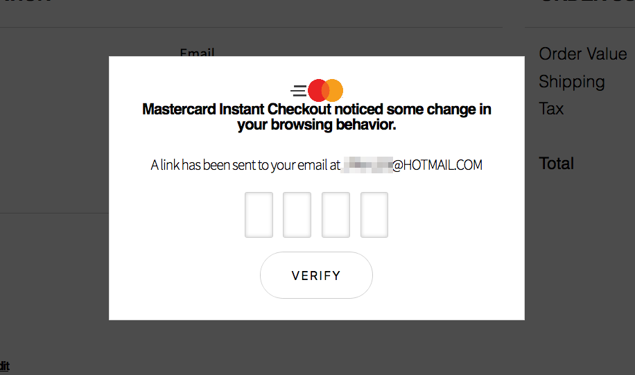
Email Pincode→ Live Prototype HereThis is the most typical step up of the bunch and currently used today, where a pincode or link is sent to the user via text or email.
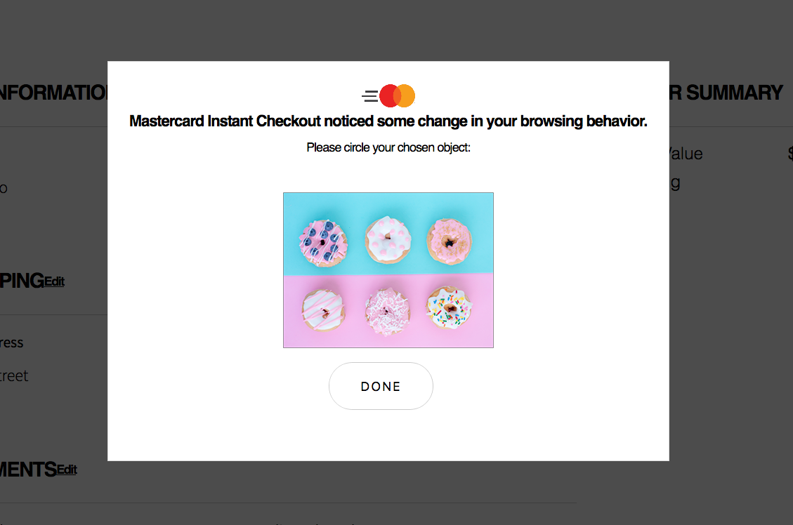
Users with this step up identified "their" donut out of an array of 6 donuts. When prompted with the array, they had to select their predetermined donut. This is playing off a Microsoft interaction called Picture Password.
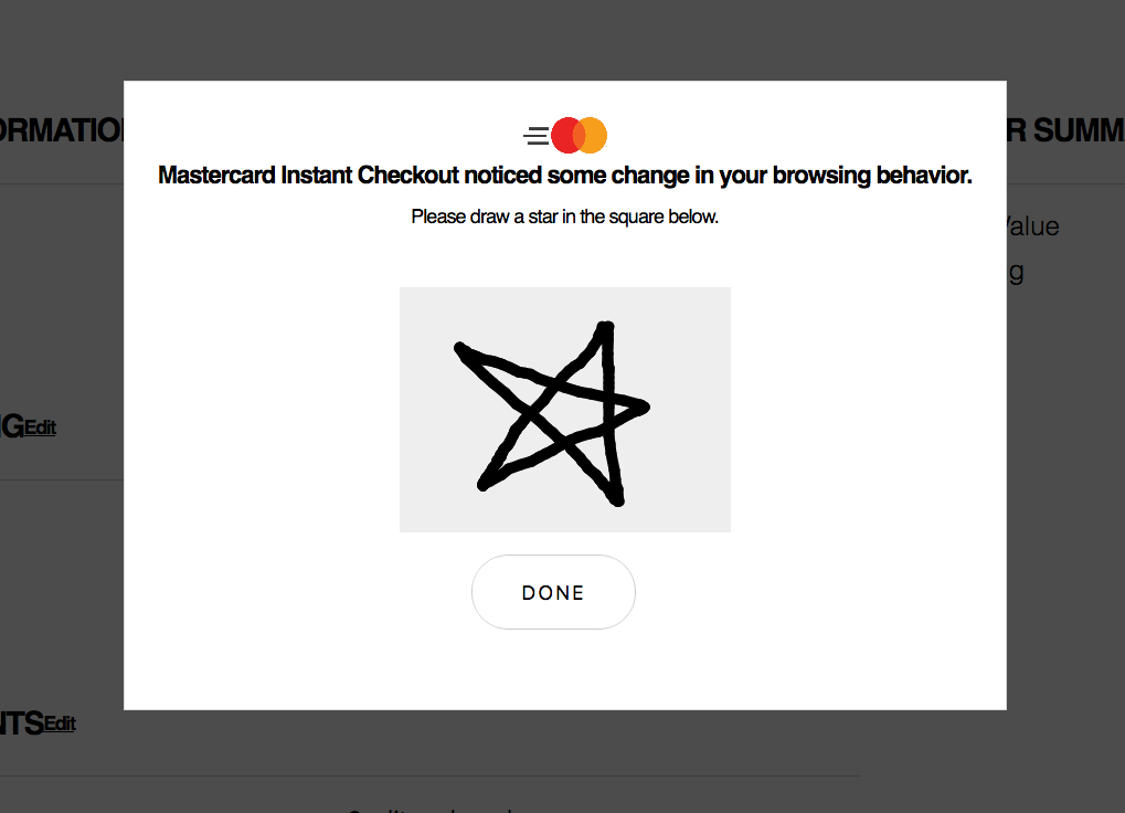
Using mouse or touchscreen input as a unique factor, users are prompted to draw a star in a canvas box. Some academic research shows drawing like this could be used as a unique identifying factor.
To test "browsing behaviour" in a step up, this shows a gallery of images and ask users to swipe through them to browse. We realized too late some functional compatibility issues between mobile and desktop without
Findings
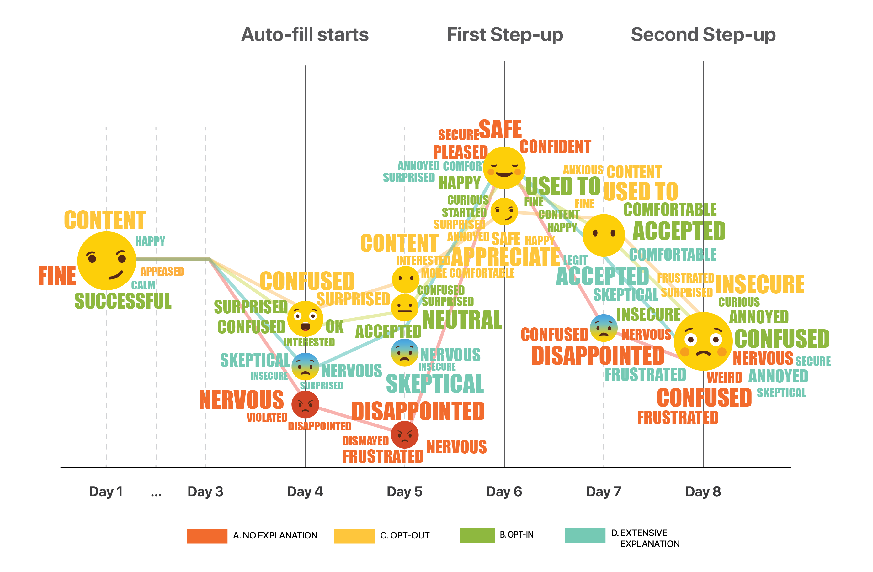
This emoji graph shows emotions by day for the various tracks.
1a.Users should always have the option to control the type of data collected.
1b.Control given during onboarding is easily ignored/misunderstood.
Track D was given the most information about Continuous Authentication during onboarding. However, it was completely forgotten by the time Day 4 came around in the study.
1c.Its acceptable to decide for users, but always give them an option to opt out.
Communicate that data is stored and protected by Mastercard
"I felt OK about the autofill… the Mastercard symbol here [shows that] it was condoned by Mastercard and it was secure in some way."
1d.Provide messaging repetitively throughout the customer journey
In one track (B) not a single person out of 5 remembered clicking the opt-in button, or 'Learn More'.
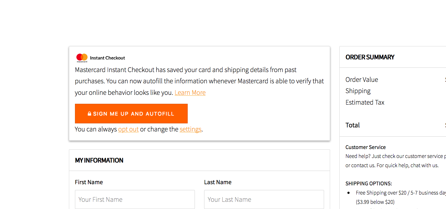 Messaging provided in the study to ask participants to opt in.
"I don't remember seeing this message!" "Didn't expect [the website] to autofill when clicking 'Sign In'" "I would want it [autofill] if I opted in to it, not that they just do it."
1e.After onboarding, re-educate the user on the merchant site and during step ups.
"[On swipe step up] it is not making me more safe. I think it is trying to sell me more things"
2a.Comprehension increases trust and comfort
2b.Education before use doesn't necessarily increase comprehension during use.
2c.Tracking "browsing behavior" makes users feel uncomfortable.
3a.Falling back to an existing authentication method is comforting to users, and enhances the experience as it reinforces their current mental model
If a bad actor has access to one factor, they may have access to more
(On swiping) "But why? It makes no sense"
"I don't like that they kept my information, but I do like that there's a human element (2FA) that I have more control… you'd have to have access to an email or some type of code."
3b.Friction in the payment process may be preferable sometimes.
4a.Despite initial discomfort, people feel more comfortable over time.
An extremely convenient experience will overcome user discomfort
("It got easier, I surprised myself that I prefer automation so much.")
4b.Users only need basic heuristics, such as icon of a green check or the Mastercard logo to feel secure
4c.Friction reinforces feeling secure - Some friction in the payment process may be preferable as it creates a sense of security
"Normally when I hit complete purchase, some sites say 'are you sure?', or 'confirm your purchase'. It's not just one click, for example, to make a decision. I like that [the ability] to rethink the purchase."