Bank App Onboarding
Concept
Over a few of these other prototypes, we started to create a couple different versions of an onboarding UI in different contexts (bank app, checkout, standalone app). We quickly narrowed down the context - users don't want to sign up for a service via their bank or credit card company while shopping online (checkout) and users don't want to download another app just to authenticate. So we ran with a mobile bank app, which many people already use to check their credit card balance on their phone, and started to test the messaging.
One question specifically here is how much do people actually want to hear about the ins-and-outs of the data collection? Or would they rather just sign up for something that will be more secure and more convenient overall?
So we tested three options:
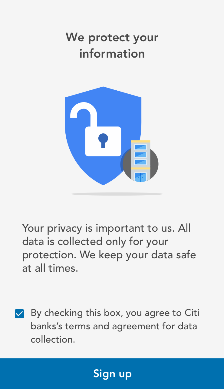
- Ultra basic - Only one sign up option. Are you in? Yes or no.
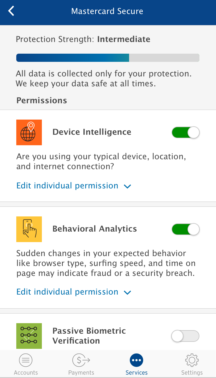
- Four data type options - You get to toggle to opt in to NuData's 4 "layers"
- Device Intelligence
- Behavioral Analytics
- Passive Biometric Verification
- Behavioral Trust Consortium (this is a NuData term)
- Four data types plus more options - The above four options with even more granular toggles for specific parts of each.
Research Questions
- How do we communicate what Continuous Authentication is, how it works, and what value it provides?
- What level of control fidelity do people want to see while onboarding?
- Is security or convenience more valuable to customers while learning about it?
Methodology
In the past, we would show users all of our prototypes in the same order. We got great feedback, but we never thought about how the feedback might be affected by rearranging the order in which people interact with our prototypes. This time, we decided to show different users different prototypes first.
Number of Users:
We had a great range of people we user tested with this week: an undergrad in their early 20s, an unemployed person in their 30s, a older lady in her 60s, and a young professional in their late 20s. We decided to take our user test participants through different sequences. Some saw the video first, others onboarded through the Citibank prototypes first and saw the video last, and others went through the Pizza Hut checkout flow first, using Continuous Authentication to pay before they really knew what it was.
Prototypes
Video
We created a video to better explain Continuous Authentication, and the value of it from both a convenience and security standpoint. This helped us get better data from users since in the past, some users did not understand why they were providing data.
We created a video to illustrate the concept in plain language. We tested comprehension by asking users to explain back various points to us around security and convenience. Before we had been trying to emphasize the convenience aspect of the technology, but this week it seemed people responded more positively to the security benefits of it, and convenience was more of an added bonus.
Bank App Onboarding
1. Only 1 checkbox to sign up, with a terms and conditions link

2. Many granular choices

Findings
All our participants were positive towards the technology - we didn't find users being creeped out as they have been in the past (for example while interacting with our Lemonade Stand prototype).
This was due to these users understanding how the technology works much better than past participants.
01.Convenience vs. Security
People were split over ranking security vs convenience, but it seems like security was the most focused on (this could be because of messaging in the app - we tacked back more towards security for this prototype).
Passivity is a bonus for security because people don't want to think about it
People saw security first, then convenience as value adds.
02.Control
Preferred version was C, but it was commonly compared to an options or preferences menu, and B was appreciated for its speed.
Prototype A was too vague and people wanted control earlier in the screen progress.
Settings control makes users feel in control
"I like B, because there's only one choice on every screen, I think about them a bit more. [On C:] This is more like a setting screen"
03.Progress Bar
The progress bar helps people both feel more secure and not skip over parts.
"[The progress bar] showed me that by adding more options, my account gets more secure. It's just a bar, but it provides a sense of trust"
04.Video
We created a video to explain the concept of Continuous Authentication and users understood the security benefits of CA after watching the video.
"If service offered for free or [for a] low cost, suspicious about companies looking to sell my information"