Convenience
Related prototypes: Avatar Storyboard / Lemonade StandThere is a well know tradeoff between usability and security: the more secure a system, the more likely it is cumbersome to use, the easier a system is to use, the more insecure it probably is.
With Continuous Authentication, it is a rare moment where the ideal authorization experience can be both easier than previous methods (password, fingerprint etc), as well as more secure. But designing for this situation requires careful research and design execution to get right.
01.Reduce cognitive load
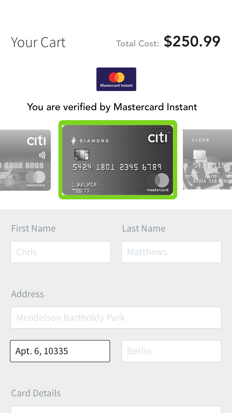
An ideal convenient checkout experience should require minimal user attention.
"When I think about payments, I don't want to think about payments."Avatar Game
 Card Visual with Shipping Address
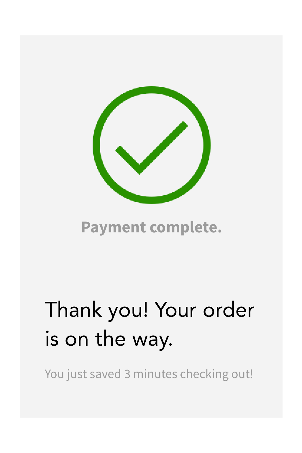
02.Celebrate Convenience
Mitigate initial discomfort of user data being saved by providing a quicker experience.

Using a green checkmark or language like "you saved 3 minutes checking out!" to celebrate a convenient checkout.
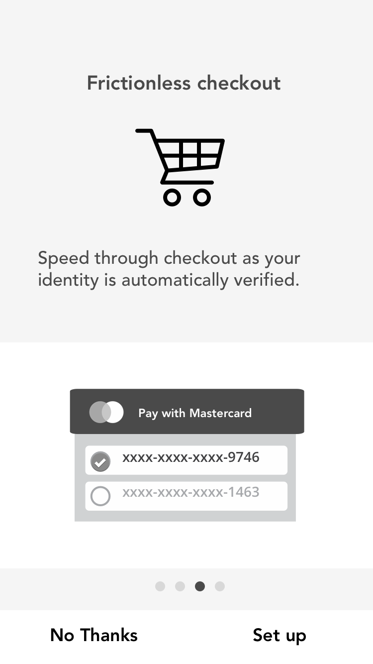
Show the convenience of the service rather than tell.
 Don't just explain how convenient the service is. It's hard for users to imagine how a new technology will work without experiencing it.
"It got easier, I surprised myself that I prefer automation so much."Customer Journey Study "It's a little creepy but I'd use it. I forget my wallet all the time…"Lemonade Stand "If my information is already filled out on there, I'm not gonna go back to Normal Checkout and delete it."Customer Journey Study
03.Friction reinforces feeling secure
Some Friction in the payment process may be preferable as it creates a sense of security
Friction communicates that information is under protection.
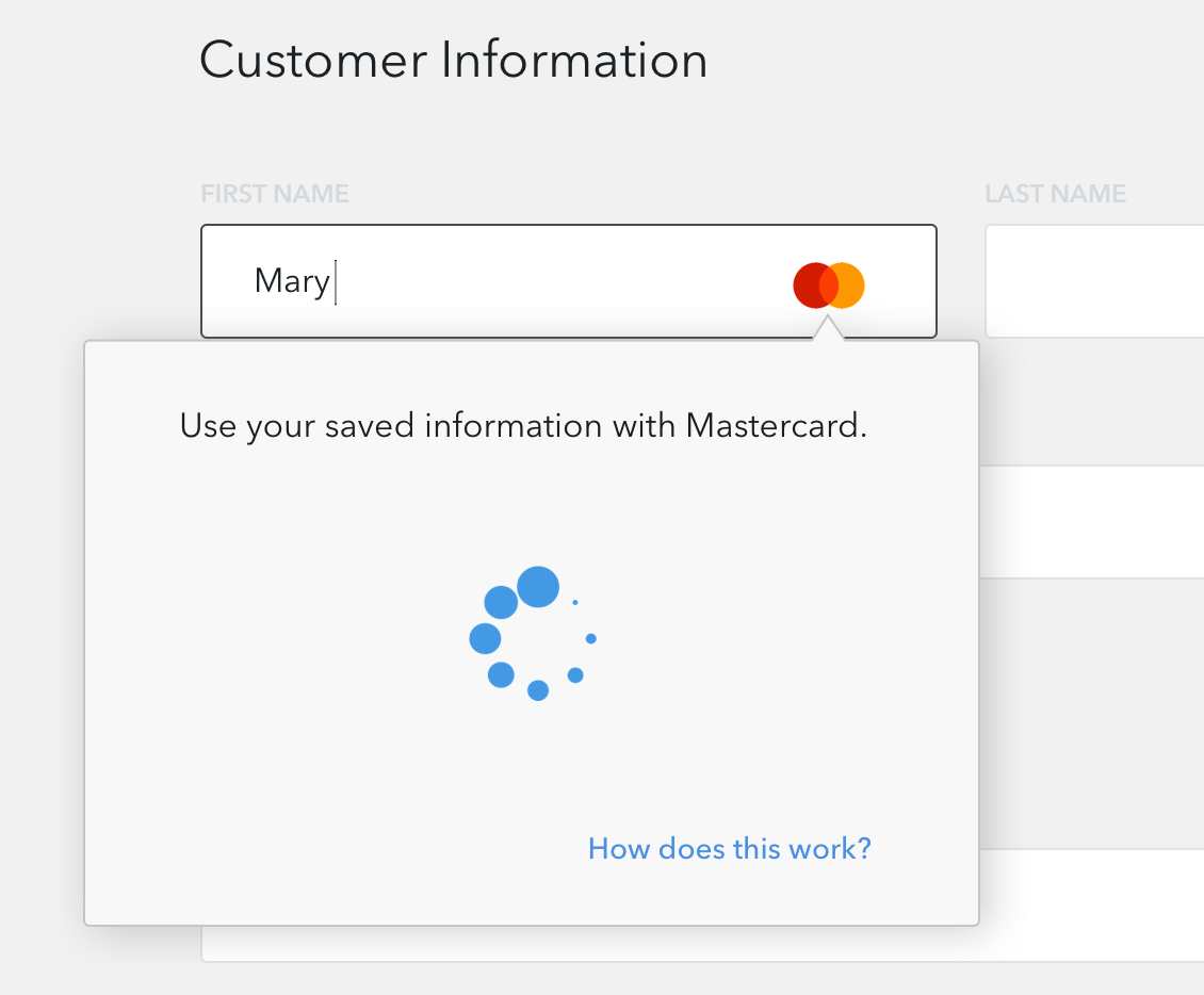
"The fact that it took some time to validate gives me confidence"Small Merchant Checkout
 Use loading animation during authentication.
Friction makes the user feel like the system is looking out for them.
"I like a little bit of friction, otherwise I might overspend, I don't trust myself."Avatar Storyboard "Normally when I hit complete purchase, some sites say 'are you sure?', or 'confirm your purchase'. It's not just one click, for example, to make a decision. I like that [the ability] to rethink the purchase."Customer Journey Study